See the page. Read the Ad.
How Heatmaps Can Help.
Last December, The Poynter Institute observed nearly four dozen individuals as they navigated their way through a number of Web sites, tracking what they call "user eyeflow" on those sites. Poynter was primarily looking at how users interacted with news sites, but it also looked at how users interact with ads before they click on (or away from) them. (...)
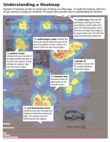
The study mocked up news Web sites and article pages that included advertising ranging from the standard 468 x 60 to in-content 300 x 250s, skyscrapers, pop-ups, and text links. Forty-six participants navigated the sites while researchers monitored their eyeflow on the pages. They then aggregated the results of where on the pages users spent time viewing to create heatmaps that show users' concentration of attention. The heatmaps plot what Poynter calls heatspots. Heatspots are aggregate representations of all participants' eye fixations on a page. Check out this heatmap. It's really cool stuff.

From the heatmaps, Poynter was able to observe (for this study at least) that some ads draw a user's attention more than others. Attention was defined by two factors: the user's eye being drawn to the ad unit and time spent viewing the ad.
(...)
A few specific observations:
- People tune out certain ad types, going so far as to avoid them. Heatmaps indicate the 468 x 60 is all but ignored, probably as many of you suspected. This type of testing may actually prove it.
- Borders around ads appear to keep attention out of the ad unit. Although some publishers require ad borders, these may need to disappear to make ads more effective.
- Ads that blend into content work. Text ads work especially well. If it looks like content, people look at it.
- Size matters. In general, larger ads perform well. That doesn't mean the largest ads performed best. Skyscrapers performed well, with 44 percent of the audience seeing them. Thirty-eight percent saw half-page ads.
- In-content 300 x 250 ads performed even better than skyscrapers and half-page ads, with 56 percent seeing them.
- Page placement plays a clear role in an ad's effectiveness. Following the typical user navigation pattern, ads that appear in the upper left corner were seen more often.
- Pop-ups are seen by 70 percent of those exposed to them. Yet they were generally closed very quickly (within three seconds) or ignored.(...)
Many of the observations are fairly intuitive. Yet if we can substantiate "observations" and turn them into "findings," we stand to become a little smarter. This kind of testing platform could really drive the media placement and creative approach we take as advertisers, agencies, and publishers.(...) As advertisers demand increased accountability, this approach stands to become another way to prove performance and to make us smarter interactive marketers.(...)
Pete Lerma.
Last December, The Poynter Institute observed nearly four dozen individuals as they navigated their way through a number of Web sites, tracking what they call "user eyeflow" on those sites. Poynter was primarily looking at how users interacted with news sites, but it also looked at how users interact with ads before they click on (or away from) them. (...)
The study mocked up news Web sites and article pages that included advertising ranging from the standard 468 x 60 to in-content 300 x 250s, skyscrapers, pop-ups, and text links. Forty-six participants navigated the sites while researchers monitored their eyeflow on the pages. They then aggregated the results of where on the pages users spent time viewing to create heatmaps that show users' concentration of attention. The heatmaps plot what Poynter calls heatspots. Heatspots are aggregate representations of all participants' eye fixations on a page. Check out this heatmap. It's really cool stuff.

From the heatmaps, Poynter was able to observe (for this study at least) that some ads draw a user's attention more than others. Attention was defined by two factors: the user's eye being drawn to the ad unit and time spent viewing the ad.
(...)
A few specific observations:
- People tune out certain ad types, going so far as to avoid them. Heatmaps indicate the 468 x 60 is all but ignored, probably as many of you suspected. This type of testing may actually prove it.
- Borders around ads appear to keep attention out of the ad unit. Although some publishers require ad borders, these may need to disappear to make ads more effective.
- Ads that blend into content work. Text ads work especially well. If it looks like content, people look at it.
- Size matters. In general, larger ads perform well. That doesn't mean the largest ads performed best. Skyscrapers performed well, with 44 percent of the audience seeing them. Thirty-eight percent saw half-page ads.
- In-content 300 x 250 ads performed even better than skyscrapers and half-page ads, with 56 percent seeing them.
- Page placement plays a clear role in an ad's effectiveness. Following the typical user navigation pattern, ads that appear in the upper left corner were seen more often.
- Pop-ups are seen by 70 percent of those exposed to them. Yet they were generally closed very quickly (within three seconds) or ignored.(...)
Many of the observations are fairly intuitive. Yet if we can substantiate "observations" and turn them into "findings," we stand to become a little smarter. This kind of testing platform could really drive the media placement and creative approach we take as advertisers, agencies, and publishers.(...) As advertisers demand increased accountability, this approach stands to become another way to prove performance and to make us smarter interactive marketers.(...)
Pete Lerma.


2 Comments:
bem que podias ter traduzido o texto,
encurtado,
essas coisas.
O tema é interessante, mas nos post acima não consigo abrir o link
Pois podia freak, e cortei um bom pedaço, mas isto teve de ficar. N sei porquê. Hoje passei o dia a cortar texto, não me apteceu ser muito rente com este.
Os posts acima já funcionam. Mea Culpa.
:)
Enviar um comentário
<< Home